

Now that we've seen what a landing page is, let's look at how to create the best landing pages.
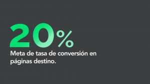
When it comes to conversion rate, a good goal is to aim for 20%. This means that 20% of all the people who visit your landing page eventually fill out the corresponding form.
It's important to pay attention to the buyer's journey, since the conversion process can happen during any stage of the buyer's journey.
You can expect a landing page promoting a consultation to get less traffic than one offering an eBook. eBooks work best in the awareness stage of the journey. And even though it gets less traffic, you should aim for a 20% conversion rate.
Let's look at a landing page. The first thing we'll do is what's known as the “blink test”. At a glance, the visitor should be able to understand the nature of the offer and why it's valuable to them.
The blink test is a great way to simulate your visitors' experience.
That's because, in reality, a visitor will make a decision about your offer within seconds.
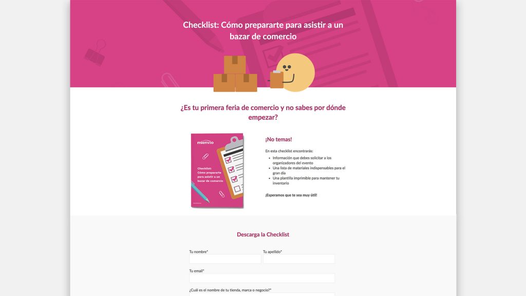
So get ready. I'm going to give you 10 seconds to evaluate a landing page. See if you can understand what the offer is and what its benefits are. It'll be quick, so pay attention. It'll be tempting to pause the video, but do your best not to. Here we go!
Time's up. Do you remember what the landing page is about? I'd bet you remember that it's about a Checklist and maybe some of the listed benefits, like knowing how to prepare to attend a trade show.
The reason this landing page is easy to understand and digest is that it's built using recommended best practices.
Now let's see what those are.
Best Practices for a Landing Page.
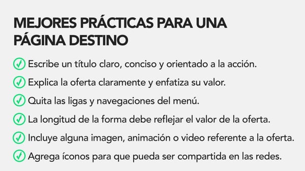
First, write a clear, concise, action-oriented title.
You're trying to communicate how your offer will help visitors to your website solve a problem or take advantage of an opportunity. Tell your visitors what they'll get and how they'll access it. Will they need to download it? Use the word “download” in the title or make it very obvious. Will they get access to a video? Use the words “Watch video.”
Be sure to include the type of offer in the title, such as eBook, Template or, in this case, Checklist; this is so search engines can understand the offer too. A simple formula for creating it is to use a verb followed by an explanation of what the offer is about, and then explain its benefit.
Next, explain the value and importance of the offer to your personas, but don't tell them about your company yet. There will be plenty of opportunities to tell them about yourself after they become leads.
In 1 to 3 sentences, explain what the offer is. Then write another 1 to 3 sentences describing how they'll benefit from the offer. Visitors make a decision within seconds, which is why we did the blink test.
What you want is to keep this page as concise as possible. If you can, try to keep all your content on a single screen so your visitor doesn't have to scroll down to read it. If that's not possible, just try to keep the content short.
It's also a good idea to use numbers, bullet points and bold text to make the information digestible. With a lot of text on the page, your visitor can lose focus or, worse, lose interest. Help your visitors focus on what's important through visual emphasis. If you choose bullet points, use 3 to 5.
Another way to keep the visitor focused on filling out the form is to remove all links and menu navigation.
Remember, the main goal of your landing page is to generate leads, so it's best to get rid of all distractions. In this example, the form is the focal point of the page and is clearly the next step the lead should take.
We want to reduce any kind of friction that could keep the visitor from filling out the form and becoming a lead. Make sure the submit button is easy to see and easy to click.
The landing page form should reflect the value of your offer in two ways: in the information requested in the form itself and in its length.
In other words, the greater the value of the offer, the more information you can ask for. Ask yourself: How much is your visitor willing to share to get this offer?
Let's see if you can answer the following question:
During which of the following stages of the Buyer's Journey can the conversion process occur?
- Awareness Stage
- Consideration Stage
- Decision Stage
- All of the above
Conversion can happen during any stage of the buyer's journey. Whether in the awareness, consideration or decision stage, all of them can convert visitors into leads.
Going back to best practices, include an image, animation or video relevant to your offer.
Including any of these elements can help you visually communicate the value of your offer to your visitors. A visual representation can help you communicate your offer much faster than a visitor can read about it.
Finally, your great offer should be shared.
Add some buttons so people can share it on their social networks. If that lead found your offer relevant and useful enough, the odds that someone in their social circle will also find it interesting are high. Give them a way to share the offer if they want to.
That's it! Those are the best practices for creating landing pages.
To recap: Write a clear title. Explain the value of your offer. Use bullet points, bold text or numbers to emphasize the value. Remove links and menu navigation. The length of the form should reflect the perceived value of the offer. Include images, animations or videos. Add icons so it can be shared on social media.
Keep this in mind as you create your landing pages, and you'll be more successful at converting visitors into leads.
Want to keep learning inbound marketing best practices?
Subscribe to our channel and our blog so you don't miss our next video!
Have comments or want to add something to this post? Leave all your questions and comments below.
Don't forget to share this post!