

Let's keep analyzing the essential elements of the conversion stage.
As we've said, we'll focus mainly on the conversion stage of the Inbound methodology, where we convert visitors into leads.
How Do You Create a Successful CTA?
Let's start by understanding:
What is a CTA?
A CTA is a button that promotes an offer and links to a landing page.
How can a CTA help convert visitors into leads?
Without a conversion process, you wouldn't have leads. And some of those leads will sooner or later become paying customers.
What is the role of a CTA in a conversion process?
When a visitor clicks a CTA, they are taken to a landing page where they fill out a form with their contact information. That's how they become a lead, or sales opportunity! After that, the lead is directed to a thank-you page, where they receive the offered content.
Where do you use a CTA?
CTAs can be placed on your website pages, your blog, and your emails. Since they trigger the conversion process, they're an extremely important first step. That's why you shouldn't forget to follow best practices when creating them. Let's talk about the factors that make a CTA successful.
-
Our CTA should be action-oriented.
Its purpose is to get your visitors to take a specific action: download an e-book, watch a video, or request a free trial. Don't make your visitors think too hard about what they should do; just tell them! Clear and direct action verbs make excellent CTAs. Be brief. Your CTA shouldn't take up much space on a page or email. It's always secondary to the rest of the content. When choosing action verbs, consider the offer and your buyer persona, and test several, such as request, sign up, download, or get.

-
As for the CTA text, use keywords consistent with your offer and landing page.
Without the keywords, would you know what the offer is about? Using the same keywords and phrases throughout the conversion process helps your visitors understand what they'll get as they move from the CTA to the landing page and on to the thank-you page.
-
It's important to capture someone's attention.
Truth be told, there are a lot of misconceptions about best practices for making an attention-grabbing CTA. Some people think it needs to be a certain color or size, or include images. However you decide to design your call to action, it must stand out so visitors click on it. Visitors recognize clickable elements such as buttons and links.
Consider your buyer personas' tastes when designing a CTA. They may prefer something flashy and bright, or they may like simple, minimal buttons. Think about what attracts them and how they usually browse websites. If you're not sure, wait. You can do some research or test several options. Use contrasting colors or one that matches your company's brand. That way, your CTAs will stand out visually.
-
Find an impactful and appropriate location on the page for your CTAs.
Sometimes this means placing the CTA above the fold, that is, before the visitor has to scroll. That way, your CTA will be one of the first things they see when they land on your page. Regardless of where you decide to place them, your CTAs should look like they belong on that page. Really, there's no right or wrong place to put them; they just need to be easy to notice, grab attention, and fit logically with the rest of the page.
For example, it makes no sense to offer an e-book on your pricing page. In this case, the visitor may already have the information the e-book contains. Someone visiting your pricing page is looking for information about your pricing structure and is very close to making a purchase decision. On your blog, it makes sense to place the CTA at the end of the post.
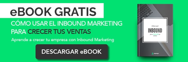
This example CTA is closely related to the topic of the post.

You've spent a lot of time on your blog posts, so instead of interrupting the content, place the CTA at the end of the post as if it were the next step. Also, include a CTA in your blog's sidebar to promote your latest offers or an upcoming event.
The sidebar is a good place to capture someone's attention and let them take the next step, such as signing up for a live Webinar. Generally, the CTAs in your sidebar are general offers that apply to a wide range of your blog readers.
If it's an email, the CTA can go at the end of the email, a paragraph, or a sentence, wherever it captures attention without causing distractions. Remember, driving lead conversion is your goal, not your readers'; make sure they can easily read your content first and convert only if they choose to.
-
Finally, test the changes and analyze their results.
When analyzing a CTA's effectiveness, you can set a goal of a 1 to 2% click-through rate. That means that, of the people who saw it, between 1 and 2% clicked the button. A successful CTA would get 1 or 2 out of every 100 visitors to click the CTA. If you compare clicks to form submissions, 10% is an excellent goal.
Of the visitors who respond to the CTA and reach the landing page, how many submit the form and convert? If 50 people reach the landing page from the CTA and 5 fill out the form on it, we have a click-to-submission rate of 10% and a successful CTA.
When you experiment with your CTA designs, make one small change and see how it performs. If I change both the CTA text and its color, I won't know which of the two changes was more or less successful. Start with one change, such as the color, and check whether it gets more clicks. This is known as A/B testing. Testing and analyzing will not only help you create more effective CTAs, but will also give you a better idea of what your buyer persona likes.
To wrap up, let's review the best practices once more.
CTAs should be action-oriented.
They should include keywords consistent with the offer you're marketing on the landing page.
A CTA should capture attention and stand out as an attractive button. It should also have an impactful and appropriate location on the page. And finally, when you create a CTA, test changes one at a time, analyze the results, and repeat.
Apply these best practices the next time you create or change a CTA, and analyze the results.
How do you create an effective CTA?
- Our CTA should be specifically action-oriented.
- As for the CTA text, use keywords consistent with your offer and landing page.
- It's important to capture someone's attention.
- Use an impactful and appropriate location on the page for your CTAs.
- Test the changes and analyze their results.
Are you now ready to create excellent calls to action?
Perfect! In our next video, we'll look at exactly that: an example of a CTA. Subscribe to our channel! and to the blog so you don't miss it.
Do you have comments, or would you like to add something to this post? Leave all your questions and comments below.
Don't forget to share this post!

