

The influence of colors on emotions and their impact on marketing is undeniable. You probably recognize a brand instantly by its colors, for example, Coca-Cola's red or Facebook's blue, so using colors correctly can help you stand out from the competition, since it increases your brand recognition by 80%.
In 2006, Satyendra Singh conducted a study titled “Impact of Color on Marketing”, which reveals that 62% to 90% of a product's assessment is based solely on its colors. That is why it is not only designers who learn about colors and the emotions they convey, but also painters, filmmakers, decorators, photographers, advertisers, etc. In this post, we tell you more about how colors and emotions can help boost your brand.
What Is Color Psychology?
Color theory is a set of principles and concepts that studies how colors interact with each other and how they affect our perceptions and emotions. This theory is based on the idea that colors have psychological and symbolic characteristics that can influence our responses and behaviors.
We should point out that color psychology is not an exact science; colors can be interpreted differently in Western and Eastern countries, so it is rather an interaction with subjectivity, in which the relevance of cultural, social, and temporal context is recognized.
You may be interested in: What Is UX Design?
What Are Warm and Cool Colors?
Warm and cool colors are two categories used to describe the characteristics and sensations associated with different color hues.
Warm colors are the shades ranging from red to orange and yellow. These colors are associated with heat, fire, and energy. They evoke feelings of warmth, enthusiasm, joy, and dynamism. Warm colors are usually perceived as more eye-catching and energetic, and they tend to advance visually, creating a sense of proximity.
On the other hand, cool colors include shades such as blue, green, and violet. These colors are associated with freshness, serenity, and calm. They convey feelings of tranquility, serenity, and stability. Cool colors are usually perceived as more distant and relaxing, and they also tend to recede visually, giving a sense of depth.
The distinction between warm and cool colors is important in design and visual communication, since each group can have different emotional and psychological effects on people. The choice of warm or cool colors in a composition can influence mood, spatial perception, and the communication of a specific message.
In her book “The Psychology of Color”, Eva Heller tells us that “anyone who knows nothing about the universal effects and symbolism of colors will never be able to use them properly,” and from a Western perspective, the most relevant colors are:

-
White: It is associated with light and purity, innocence, peace, and clarity. It can also evoke feelings of cleanliness and freshness. In addition, it carries connotations of neutrality and simplicity.
-
Gray: The midpoint between white and black, it represents neutrality, objectivity, and stability. It is often associated with seriousness, formality, and maturity. However, it can also convey feelings of monotony and a lack of emotion.
-
Black: It usually evokes mystery, elegance, and power. It also represents formality and sophistication. In addition, it can convey a sense of authority and confidence. On the other hand, black can also have negative connotations, such as sadness or death.
-
Yellow: It is related to joy, energy, and happiness. This color can generate optimism and warmth. It can also capture attention and stimulate mental activity. However, in excess, yellow can be overwhelming or cause anxiety, and it is often considered a color that represents betrayal, insecurity, and impulsiveness.
-
Green: It is associated with nature, harmony, and freshness. It conveys feelings of balance and calm. In addition, green is related to hope, growth, and renewal. It can be used to represent fertility and health.
-
Blue: It evokes calm, serenity, and tranquility. It represents stability and trust. It conveys cleanliness and freshness. It is also related to introspection and spirituality.
-
Violet: It speaks to us of creativity, spirituality, and imagination. It can evoke mystery and depth. This color is often used to represent individuality and originality.
-
Pink: It is associated with femininity, delicacy, and tenderness. It evokes a sense of softness and romance. It is often used to represent love and compassion. However, it can also have connotations of fragility or superficiality. It often brings childhood to mind.
-
Red: It is related to passion, energy, and intensity. It can evoke strong emotions and draw attention. It conveys sensuality and love. In addition, red can convey a sense of urgency or danger.

Colors in Marketing
In corporate branding and advertising campaigns, the colors that will be used are chosen very carefully to convey the brand's values and ideals and, above all, to gain an edge over the competition.
-
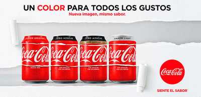
Coca-Cola: It is known for its use of the color red in its branding. Red conveys passion, energy, and excitement. Coca-Cola has leveraged these attributes to convey the idea that its drink is refreshing and exciting. In addition, red also helps the brand stand out on shelves and capture consumers' attention.
-
Facebook: The color blue is widely used by Facebook in its branding and design. Blue is associated with trust, stability, and calm. Facebook seeks to convey the idea that its platform is safe and trustworthy for users. In addition, blue is a color perceived as friendly and approachable, which fits well with the image Facebook wants to project.

- McDonald's: It has used the color yellow in its branding for decades. Yellow is a color associated with joy, energy, and optimism. McDonald's seeks to deliver a positive and fun experience to its customers, and yellow helps evoke those feelings. In addition, yellow is believed to stimulate appetite, which is beneficial for a fast-food chain.

In conclusion, choosing the right color or color combination for your brand goes beyond its aesthetics, since colors convey a message on an emotional level that will affect the way customers think, experience emotions, and act. Not being aware of this message could result in the loss of customers and, ultimately, of sales without even realizing it. In short, understanding the power of color in marketing is crucial to maximizing your brand's impact and success. Stand out and connect with your customers effectively; at Digitalegia, we can help!

