


We are talking about a communication tool that conveys information and ideas through words. Typography is the term used for the study, design, and classification of typefaces and fonts, as well as for the design of characters.
The same text in a different typeface conveys a completely different feeling or meaning. That is why typography is one of the most important pillars of design, and it is important to choose the right one, keeping in mind what we want to convey and for what or for whom.
When choosing the typeface for our project, in addition to the font type, we must consider both the format (advertising poster, magazine, packaging…) and the medium in which it will be produced (print or digital). The communicative capacity of typography and its legibility can vary depending on the medium in which it appears. We will also take into account the length of the text to improve legibility and, in this way, make reading easier.
Serif
Serif fonts have their origins in the past: when letters were carved into stone blocks, the ends were finished off because it was difficult to make sure the edges of the letters were straight. They include all Roman and Egyptian typefaces. For example: Times New Roman, Palatino, Georgia, Garamond, Rockwell, Baskerville, Trajan, Centaur, Monticello…
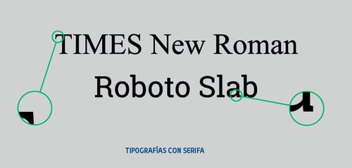
By using this type of font, we can convey seriousness, tradition, respect… They are also used for long texts, since they improve legibility by creating an imaginary line beneath the text.
Sans Serif
Sans Serif or Etruscan fonts originated in England in 1820. They are typefaces with straight terminals that lack serifs. They are associated with commercial typography because of their good legibility in short, large-size texts. Likewise, they are well suited for on-screen display, since they are very legible at smaller sizes.
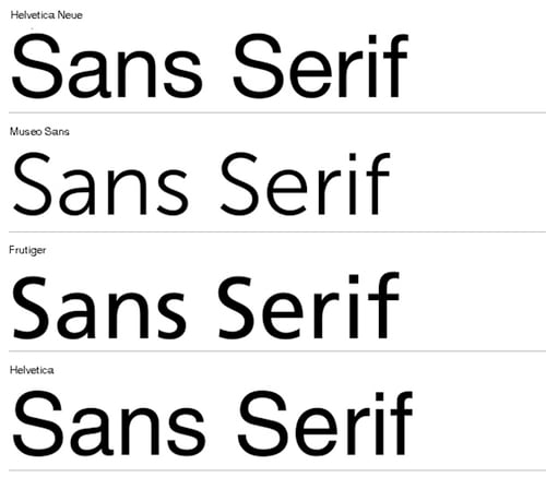
This type of font includes all Lineal typefaces: Arial, Helvetica, Tahoma, Century Gothic, Verdana, Monaco, Geneva, Impact, Avant Garde Gothic, Futura, Avenir…
Sans Serif fonts convey modernity, security, joy, minimalism, lightness, neutrality.
Script
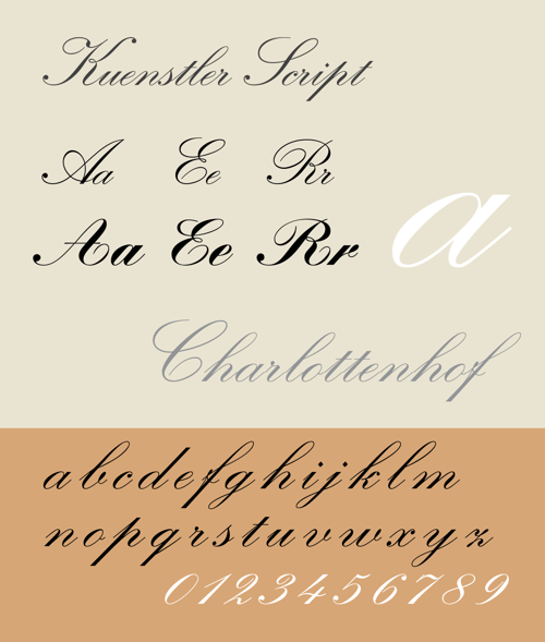
Script typefaces are characterized by ligatures between the letters; the letters are joined to one another. They are calligraphic typefaces based on the variety and flow of the strokes created in handwriting.
These fonts convey elegance, luxury, quality, tradition… They are ideal for classic projects with a lot of history and tradition.
Some examples of Script typefaces: Parisienne, Linotype Zapfino, Virtuosa Classic, Vladimir Script, Libelle…
These fonts convey elegance, luxury, quality, tradition… They are ideal for classic projects with a lot of history and tradition.
Some examples of Script typefaces: Parisienne, Linotype Zapfino, Virtuosa Classic, Vladimir Script, Libelle…
Decorative
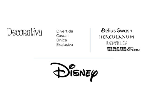
These typefaces include very diverse type families with a lot of personality. Because of their highly distinctive shapes and their well-defined, concrete personality, they are suitable for giving a design a historical or cultural character, and they stand out from other typefaces.
They are used for specific purposes such as titles, headings… They are not suitable for blocks of text, since they make them harder to read.
Examples of decorative typefaces: Fantasía, Motherline Vintage, Rolla, Sinara, Lawless, Mightype, Selima, Art Nouveau…
In conclusion, typefaces should maintain a logic or coherence and follow a similar format according to what you are trying to convey in each case.
If you want to learn more about design in marketing, don't forget to subscribe to our blog, or subscribe to our YouTube channel!

Don't forget to share this post!


